Work on the HomeGround anthology is still ongoing, though we are near the end of the first working draft (I’m currently working on the final part of the “Five Years Ago”/News/etc chronology for 2005-2008).
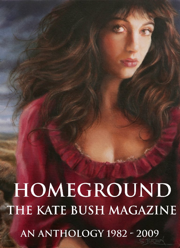
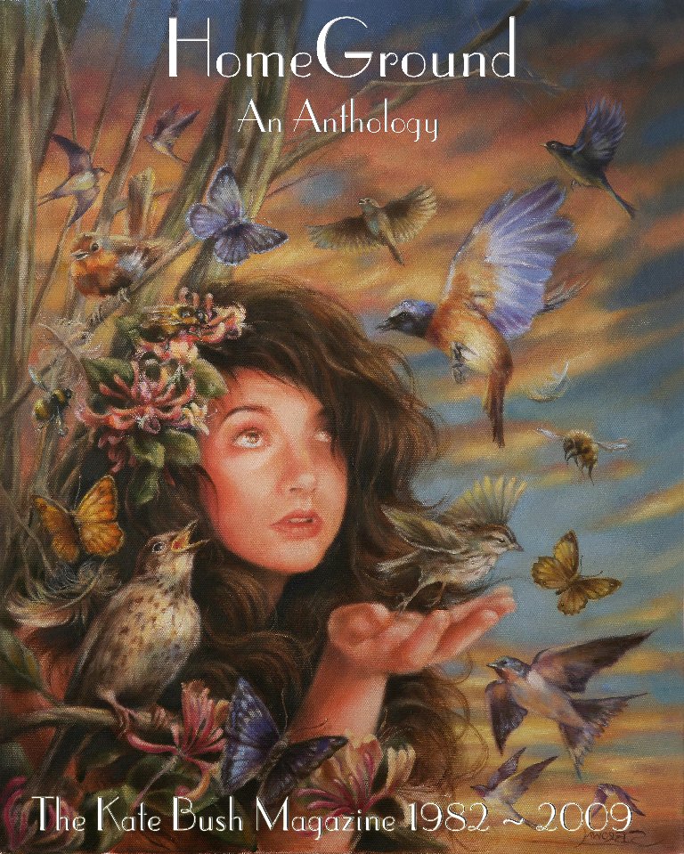
Here is a glimpse of ideas for the front and back covers using the beautiful artwork done for us by Steven Brown. Still to settle exact design/typeface and lay out, but it will be something like this:

The idea is that the anthology is “bookended” between Wuthering Heights and Aerial:

We are enourmously grateful to Steven, who took time out of his busy schedule to create these beautiful images for us.

Collin Kelley
The cover art is stunning. Can’t wait!
Pablito
Wow, this is a cut above the usual stuff – gorgeous artwork!
Tom
The art is lovely!
Del Palmer
Can I just toss in my two pennyworth??…. I love the second one of the two.. Reminds me of Never Forever.. I think that you-know-who would like that one too!!..
Rob (Kestrel)
Beautiful artwork, and i think the typeface looks fine too.
I don’t think you can position it any other way than you have to be honest.
Lisa Oliver
I especially like the back cover – I don’t think that the proposed front cover is a good likeness (please don’t shoot me, just my opinion). Very much looking forward to the book’s completion.
Sky
Lisa, I agree with you that the ‘rear’ should become the ‘front.’ See my comment further down about the artist friend. Like you, I can hardly wait for this book which will be so special. xx
Sky
Gorgeous, sensitive artwork. I love the theme of being bookended by WH and Ariel. Agree with Del that KB would adore the rear cover artwork, it struck me straight away as NFE style. Anf of course I love all things that fly. xxx
Sky
Just shown the artwork to an artist friend who’s instant reaction was ‘use the Arial picture for the front – catches the eye immediately and is more contemporary.’ I tend to agree. I know it would make sense to have the WH pic as the front cover, and it is very beautiful and classic, but I feel the Arial picture has more immediate impact. As we’re looking back down the years, maybe this would be the most appropriate for a cover? Just a thought. 🙂 xx
Edwin
I’ll bet the second cover will win. Really love the painting.
Alice
The second cover all the way. It’s beautiful. I personally think the typeface for the word “Homeground” looks a little… WI-ish. Maybe would look nicer in the font from the first cover? Would distinct the title a bit more in my opinion. Other than that it’s perfect.
chris
I agree with those who like the back cover as the front cover. The proposed front cover is good but not quite “magical” for Kate, It must be “special” It’s Kate,afterall
Keith Pitches
Great cover!!
Peter
Hello Keith! Long time no speak.
Lisa Campbell
Love both of the covers, but the more Never Forever Inspired cover does it for me! £35 does seem a little steep for the book price though.
Peter
That would have been the price for the hardback. It is more likely that the format of the book will be soft cover at £20-£25
Guusje
I can’t wait! I think £35 is still pretty cheap for a book like that! When will it come out? X
Peter
Looking at sometime next year. Am just completing first “draft”.
andy murray
do we have a date for publication yet?will it be available on amazon ,play.com ,waterstones?and will there be a choice of hard cover and soft cover?
Peter
Hello Andy,
We’re correcting at the moment. We have Autumn in mind for publication. We understand from the publisher that it will be available on Amazon. Don’t know about others. Final decisions on hard/soft cover to be made, also whether one or two volumes. Will keep eveyone updated.