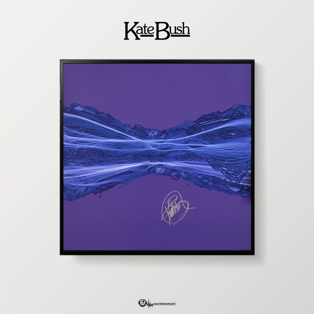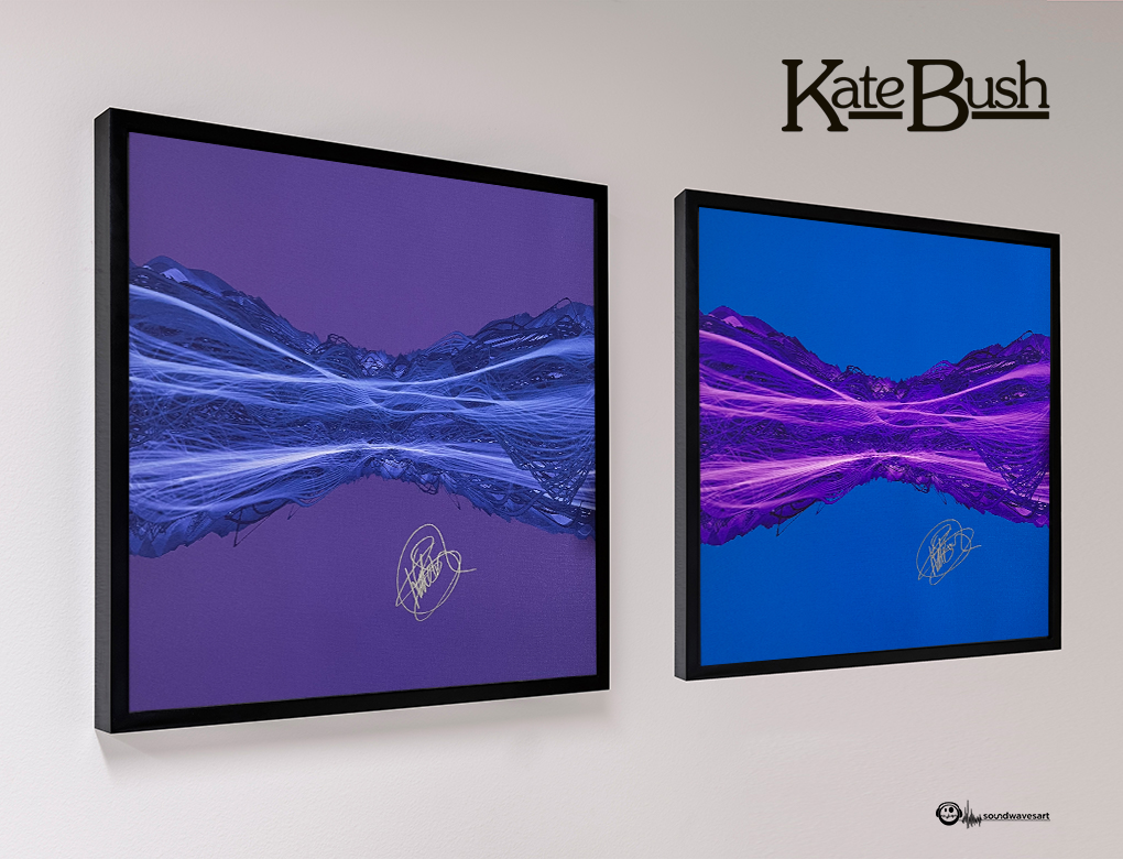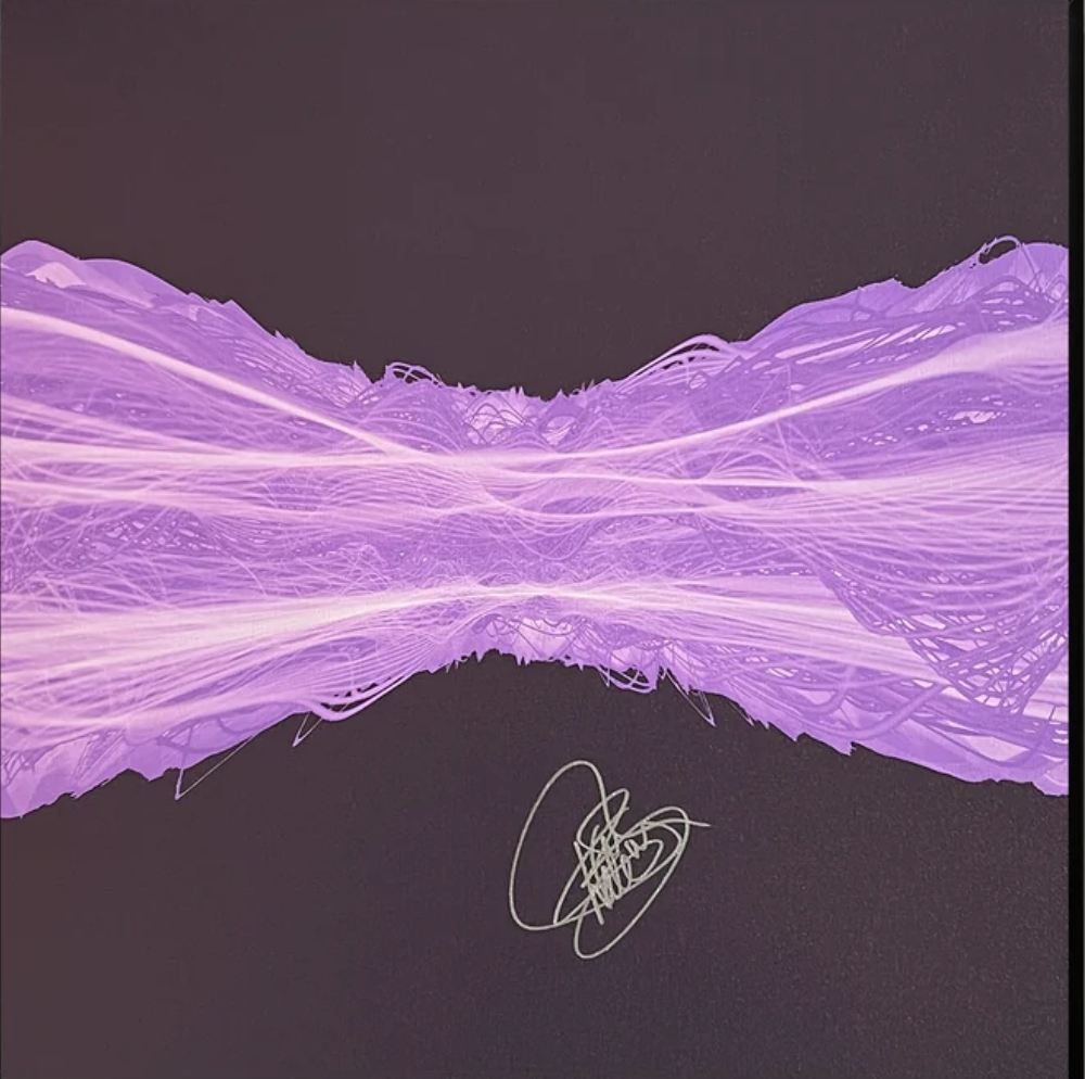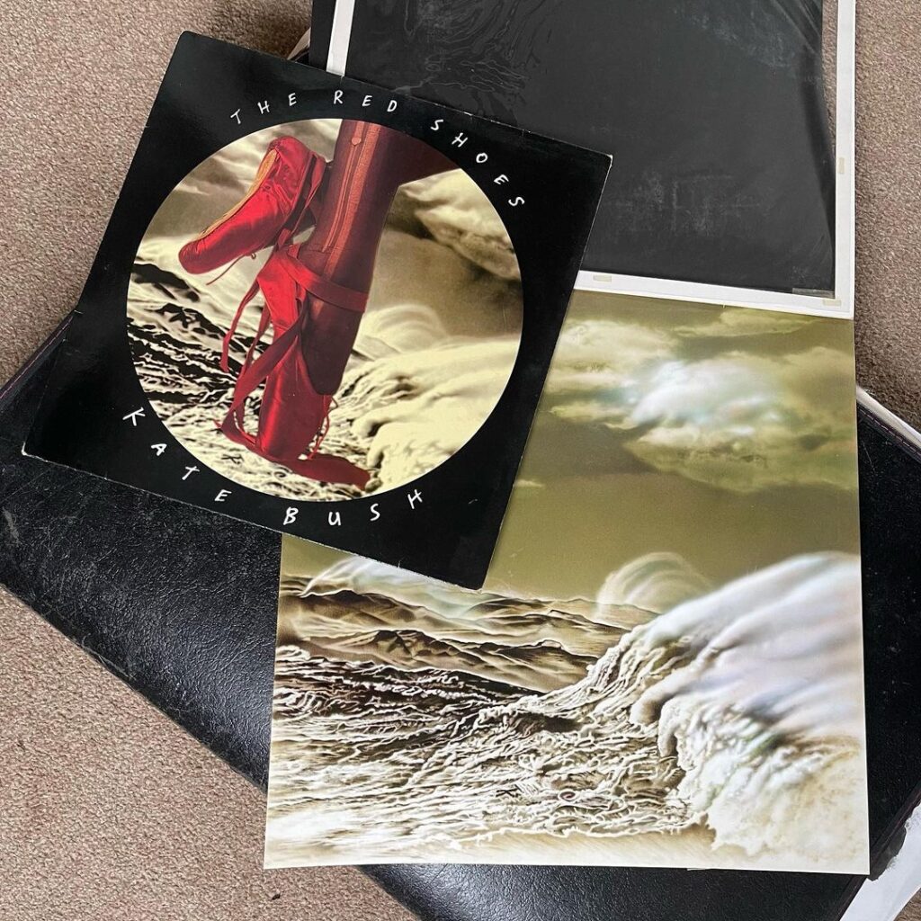
For decades fans had debated whether that background on Kate’s 1993 The Red Shoes album cover showed a landscape, a tempestuous body of water or even the grooves of a vinyl record but this morning a fascinating post on Instagram sheds more light on what Kate’s feet are dancing on…
Studio Wallop is a collaborative motion design studio based in Plymouth and Cornwall in the UK set up by director and designer Stephen Tolfrey. They write:
“Looking through some old portfolios I found this. It’s the original airbrush illustration by Mark Wilkinson we had commissioned for the Kate Bush album cover The Red Shoes. The year was 1993 and we were still doing mechanical artwork! Shoes photo (these are Kate’s feet) by John Carder Bush. Sleeve design and artwork by Stephen Tolfrey”
Mark Wilkinson’s work can be seen at his official site – he has also designed artwork for bands like Iron Maiden and Marillion. Update: Mark spotted our post and had the following to say about the illustration from his Facebook account:
“The KT is there, I declared myself a huge fan, so Kate said that I must know of the symbol KT on ( most? not sure) albums that appeared on her albums up to then. It’s plain to see on Lionheart, not sure about the rest. Anyway, I did as I was asked and airbrushed it on. The original airbrush art I always assumed had gone missing. It was meant to be ambiguous, were they waves or desert dunes. It didn’t matter really. It’s absolutely one of my favourite albums of Kate’s and a privilege to be asked to contribute in a small way to the design“
Read more about Stephen Tolfrey and Studio Wallop at their website here. Instagram post is here. The creatives there were also involved in some of the promotional design for The Red Shoes including a proof of a poster for the Moments of Pleasure single. They write: “Another find. A cromalin proof of some point of sale we designed back in the day. Anyone else old enough out there remember cromalins?”
